Sprite work
4 posters
Page 1 of 1
 Re: Sprite work
Cow Girl (casino manager?)
Pros (imo)
Stylized proportions
(long legs)
Cons
The hat is off center.
Fix: move to position where dome of the hat would match head curve. Imagine the hole of the hat wrapping around the head. Hair included.
Her right thigh extends to the knee; too long by 2 pixels.
Fix: shorten right thigh (her right, not ours). Adjust the other leg as necessary by shaving off a length of pixel (or 2) near the ankle ie the exposed skin.
Crotch line where the legs meet; is awkward.
Fix: Remove line. Adjust where the legs meet to the right by 1 or 2 pixels (viewers right)
Short looking arms.
Fix: Define sleeves with shading. and extend arms by one pixel length each at the wrists.
Pillow Shaded.
Fix: Apply proper shading.
I like the readability of the shirt collar. That was well done at this scale of sprite.
As for shading, study sprites that have a similar pose as well as shading itself. Since the coat is open. The back end is too flat. A curvy line would go a long way in giving the coat dimension.
The second sprite...how do I even?
Pros (imo)
Hyper Stylized Proportions
Cons
Pillow Shaded.
Fix: Apply proper shading.
This sprite...well, with breasts that big. Their current position looks unnatural and higher on the chest then they should be. Gravity would pull them down. This sprite shares some problems with the first. Also, This is the first of this kind of design on a trainer sprite that I've seen, awesome.
Overall the sprites are pillow shaded and need work. Things to improve upon are shading, proportions and making adjustments on fusions. Keep practicing and you'll improve. (I know it sounds cliche, but it's true! I swear!)
Pros (imo)
Stylized proportions
(long legs)
Cons
The hat is off center.
Fix: move to position where dome of the hat would match head curve. Imagine the hole of the hat wrapping around the head. Hair included.
Her right thigh extends to the knee; too long by 2 pixels.
Fix: shorten right thigh (her right, not ours). Adjust the other leg as necessary by shaving off a length of pixel (or 2) near the ankle ie the exposed skin.
Crotch line where the legs meet; is awkward.
Fix: Remove line. Adjust where the legs meet to the right by 1 or 2 pixels (viewers right)
Short looking arms.
Fix: Define sleeves with shading. and extend arms by one pixel length each at the wrists.
Pillow Shaded.
Fix: Apply proper shading.
I like the readability of the shirt collar. That was well done at this scale of sprite.
As for shading, study sprites that have a similar pose as well as shading itself. Since the coat is open. The back end is too flat. A curvy line would go a long way in giving the coat dimension.
The second sprite...how do I even?
Pros (imo)
Hyper Stylized Proportions
Cons
Pillow Shaded.
Fix: Apply proper shading.
This sprite...well, with breasts that big. Their current position looks unnatural and higher on the chest then they should be. Gravity would pull them down. This sprite shares some problems with the first. Also, This is the first of this kind of design on a trainer sprite that I've seen, awesome.
Overall the sprites are pillow shaded and need work. Things to improve upon are shading, proportions and making adjustments on fusions. Keep practicing and you'll improve. (I know it sounds cliche, but it's true! I swear!)
Exodus Winter- Wild Abra
- Posts : 8
Join date : 2014-12-06
 Re: Sprite work
That's definitely an improvement. The highlights suggest strong light coming from the viewers left. The big piece of the necklace, keeps the torso from appearing flat; it is shaded enough to the point that I can distinguish that it's there. However, if the decal wasn't on the jersey. The necklace and the jersey would blend into a blob.
This sprite has massive arms and appear like they have borderline 3 dimensions. Using the strong light to your advantage; you can use the shading to define the muscles of the arms and shoulders. Arm-day er'day.
Shading on the legs are kinda fine, His left leg; part of the shading is going flat down. Just shave off a vertical line of shading just enough to give the thigh some dimension.
The shoes are tacky. Details like stripes or a pattern on the side of the shoe would give the sprite...more.
Hands are hard...try splicing on some different hands that match the pose. Although, I recommend studying the hands of sprited NPCs. To see why they used the lines and color. Where they did; to define the hand.
The head could use some more shading. Down the middle on his face and using the shading to indicate the nose. Leave some base color on the forehead. Wrap the shading around the edges of the brow and up to the brown cap. This sprite has no neck, but with arms that big; who needs one. Right? Seriously tho.
He looks angry with me. I'm probably starting to annoy him. lol
To tie this all off. Some color variance would help. So, yeh! Keep it up.
Exodus Winter- Wild Abra
- Posts : 8
Join date : 2014-12-06
 Re: Sprite work
Thanks =DExodus Winter wrote:That's definitely an improvement. The highlights suggest strong light coming from the viewers left. The big piece of the necklace, keeps the torso from appearing flat; it is shaded enough to the point that I can distinguish that it's there. However, if the decal wasn't on the jersey. The necklace and the jersey would blend into a blob.
This sprite has massive arms and appear like they have borderline 3 dimensions. Using the strong light to your advantage; you can use the shading to define the muscles of the arms and shoulders. Arm-day er'day.
Shading on the legs are kinda fine, His left leg; part of the shading is going flat down. Just shave off a vertical line of shading just enough to give the thigh some dimension.
The shoes are tacky. Details like stripes or a pattern on the side of the shoe would give the sprite...more.
Hands are hard...try splicing on some different hands that match the pose. Although, I recommend studying the hands of sprited NPCs. To see why they used the lines and color. Where they did; to define the hand.
The head could use some more shading. Down the middle on his face and using the shading to indicate the nose. Leave some base color on the forehead. Wrap the shading around the edges of the brow and up to the brown cap. This sprite has no neck, but with arms that big; who needs one. Right? Seriously tho.
He looks angry with me. I'm probably starting to annoy him. lol
To tie this all off. Some color variance would help. So, yeh! Keep it up.
Kiriyawave- Splashing Hoppip
- Posts : 17
Join date : 2014-12-07
 Re: Sprite work
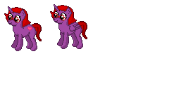
The next sprite I have is one made from scratch 


Kiriyawave- Splashing Hoppip
- Posts : 17
Join date : 2014-12-07
 Re: Sprite work
Thats pretty cool.

Yria/Mara LB- Bizarre Adventurer
- Posts : 744
Join date : 2015-01-01
Age : 22
Location : Nowhere
 Re: Sprite work
Thanx =DYria/Mara LB wrote:Thats pretty cool.
Kiriyawave- Splashing Hoppip
- Posts : 17
Join date : 2014-12-07
 Re: Sprite work
Here is the next sprite I made from scratch 


Kiriyawave- Splashing Hoppip
- Posts : 17
Join date : 2014-12-07
 Re: Sprite work
Cool.

Zenox-rmp- Post Level: Banned from Ubers
- Posts : 1078
Join date : 2015-03-14
Age : 25
Location : A million laugues above you.
 Similar topics
» 13gamer2000 sprite work in progress
» Silver League Sprite Contest [archived]
» Some of my work
» Custom Gym Leader Sprites + Work in progress fan game
» Next fakemon set ( needs work)
» Silver League Sprite Contest [archived]
» Some of my work
» Custom Gym Leader Sprites + Work in progress fan game
» Next fakemon set ( needs work)
Page 1 of 1
Permissions in this forum:
You cannot reply to topics in this forum


» What Happened To All of the Silver League Media?
» Pokemon BluRay Questions
» Getting banned from The Silver League Discord
» Hyper Training all your 6 stats (especially the Attack stat) actually a flaw for Special Attackers when you consider Confusion?
» List of all Pokémon that have Transfer only moves?
» My competitive team for Pokemon Sword and shield
» General League Information
» Can anyone help me with this Pokedex?